New website with dynamic fly-out navigation
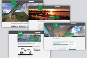
Since October 8, 2014, the internet presence of Heidelberg Cement AG appears in a new design. The website was visually, structurally and technically revised in a fundamental way.
“Our goal was a modern website with high recognition value of the corporate design of Heidelberger combined with enhanced information and optimized functionalities for the user,” explains Christiane Bohlmann, Head of Marketing Germany at HeidelbergCement. “As a whole, our website is visually much more appealing now.” Larger images and less text have the site appear tidy, light and inviting. A modern font and a harmonious color scheme complete the new presence.
Download center
with more than 700 files
Functionality is not neglected either: The new dynamic fly-out navigation provides for a good overview on all menu items at a glance. Footer navigation at the bottom edge of each page serves as secondary navigation, directly leading to all important topics of the page. Numerous teasers with images and text boxes are used to highlight current information given on the page in an appealing way.
The topic of biodiversity was granted much more scope: Visitors to the website can read up on the development of species diversity at the mining sites of HeidelbergCement as well as on the national biodiversity proj-ects as, for example, natural and discovery trails.
Also new is a download center with more than 700 files, such as declarations of performance, technical data sheets, safety data sheets and the issues of the magazine Context. Moreover, the new website of HeidelbergCement also meets the requirements of mobile devices with smaller displays, such as tablets and smart phones.
