Heidelberger Beton

New corporate design introduced

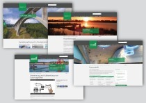
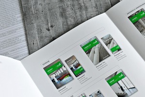
In future, HeidelbergCement will appear in public well-arranged, with a new typography and an ever stronger presence of the corporate color green. According to its own statement, the company has already strengthened the individual divisions and brands in Germany successfully in the past few years by means of a compelling appearance. The new design is to enhance the positive aspects of the previous corporate identity and to abandon what is not important.

Clarity has top priority

Product and image advertisements, for example, are designed more generously. Besides large-scale pictures showing...
Related articles:

Issue 02/2013 Autostadt Wolfsburg

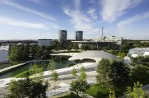
Design of Porsche Pavilion

Volkswagen AG presents itself and the brands under the umbrella of the parent company ? Volkswagen Group ? (Audi, Bentley, Bugatti, Ducati, Lamborghini, MAN, Scania, Seat, Skoda and Volkswagen...

more
Issue 04/2016 Huntsman

Driving performance in color concrete

Huntsman Pigments and Additives is a leading supplier of inorganic pigments and functional additives for the construction industry. In addition to our high-quality pigments, pigments, our customers...

more
Issue 01/2012

Harmony in color and shape

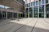
At its ancestral territory, the Dortmund-based insurance com­pany Volkswohl Bund, one of the largest broker insurers in Germany, has built a new administration building for about 500 employees being...

more
Issue 11/2014 HeidelbergCement

New website with dynamic fly-out navigation

Since October 8, 2014, the internet presence of Heidelberg ­Cement AG appears in a new design. The website was visually, structurally and technically revised in a fundamental way. “Our goal was a...

more
Issue 06/2022 KANN BAUSTOFFWERKE

New Alesaro Betonplus design slab

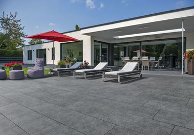
Patios, in modern architecture, are open spaces in which generously designed exterior outdoor areas homogenously and harmoniously make a pleasing presentation. Clear delineations dominate, with the...

more